Branding
/
Packaging
/
Art Direction
Skrewball Whiskey
(
2
)

/ About the project
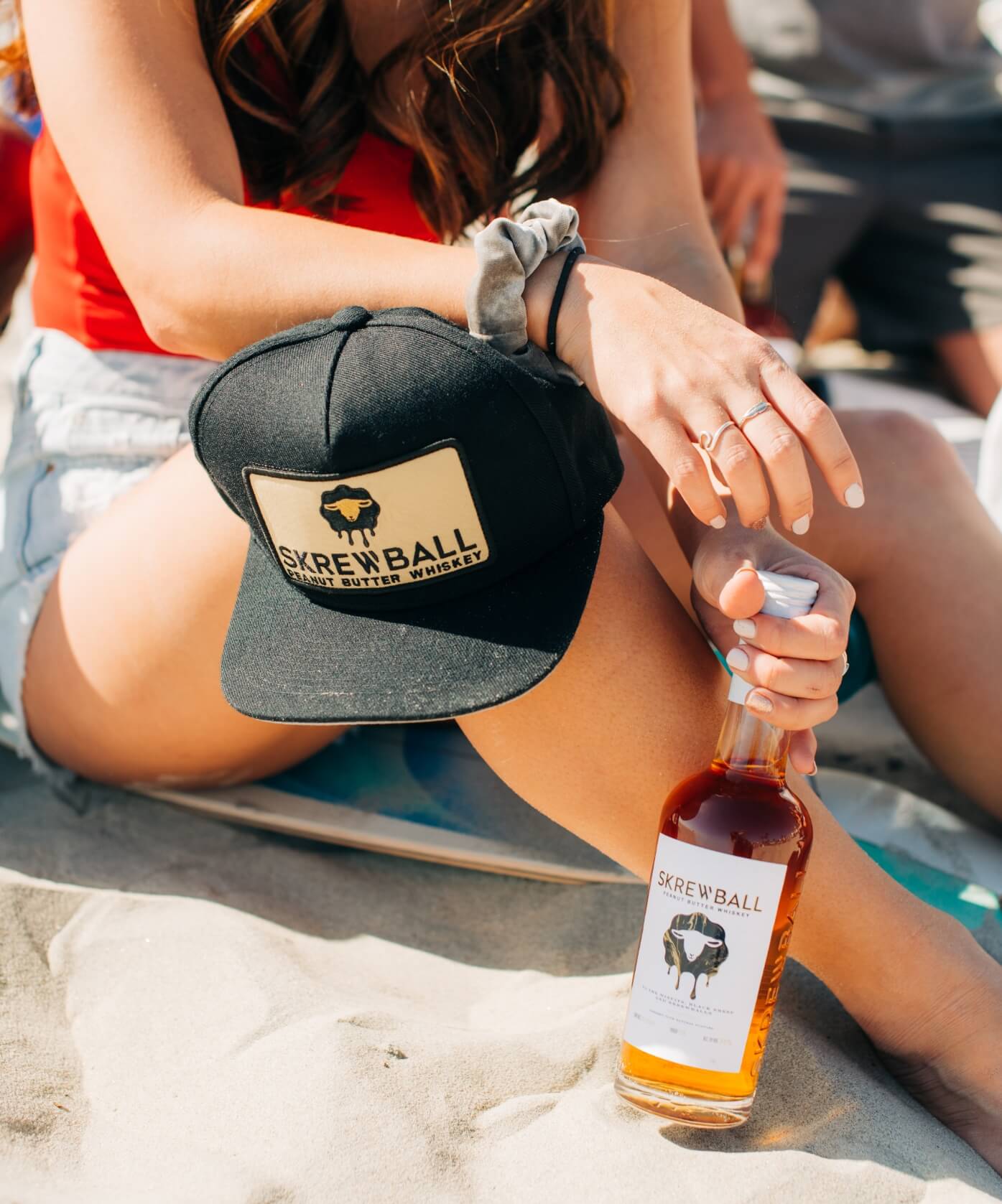
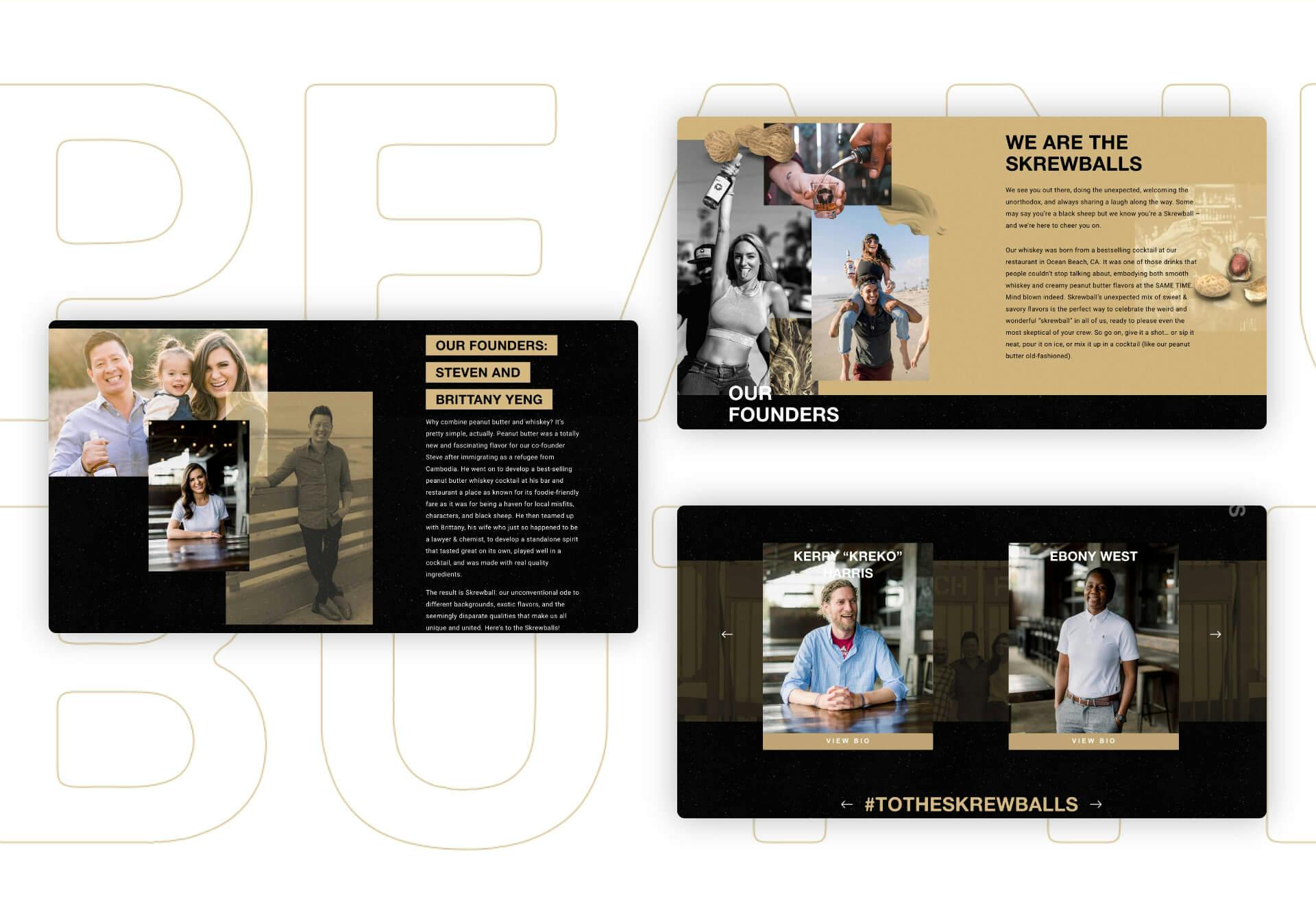
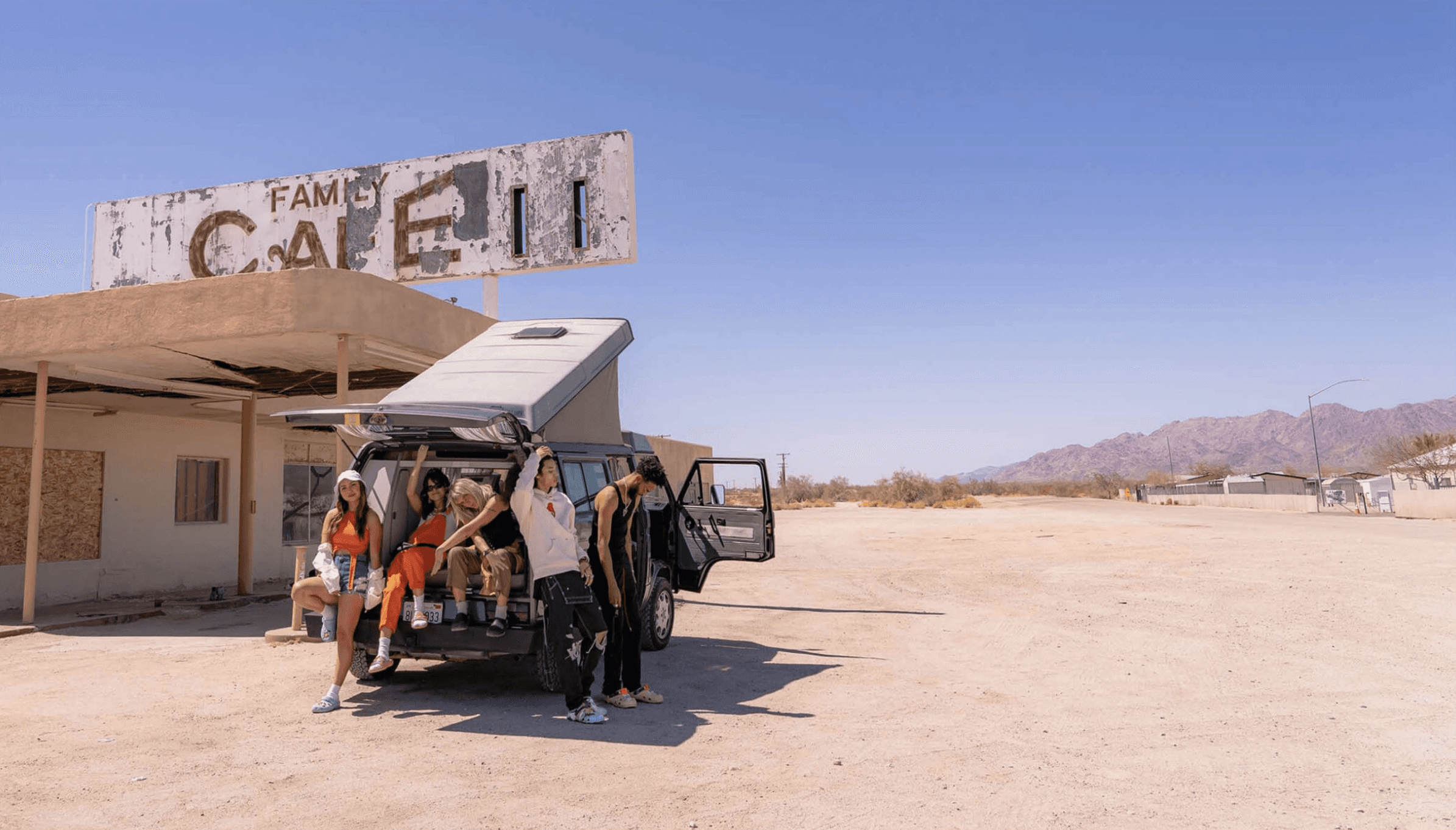
During my time at Movetic, we crafted a bold brand for Skrewball, targeting those who embrace individuality and stand out from the crowd. Our approach was deeply researched and data-driven, resulting in a brand identity rooted in uplifting imagery and messaging tailored to this specific audience.
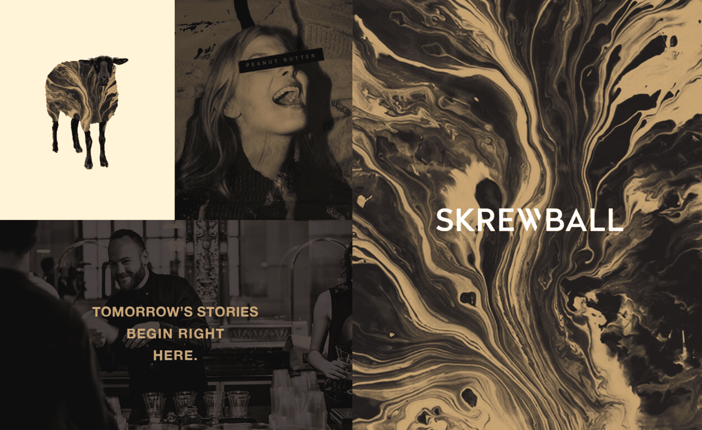
Drawing inspiration from the concept of 'black sheep,' our logo features expressive sheep imagery merged with liquid textures, symbolizing the fusion of peanut butter and whiskey. We designed both graphical and realistic versions of the logo to capture the essence of individualism.
The modern logotype, with a custom "W" emphasizing uniqueness, adds a contemporary flair while maintaining readability. The color palette, derived from peanut butter and whiskey hues, enhances the brand's visual identity, complemented by textures that amplify the sense of rebellion and nonconformity.
/ Credits
Client:
Skrewball Whiskey
Creative Director:
Andrew DiPaolo, Daniel Wells
/ Year
2018-2024
Get in touch


